Overview
With a focus on what moves each learner, HMH delivers what educators need to foster growth and build lasting momentum. The company creates integrated K–12 learning solutions for core, supplemental, intervention, assessment, and professional learning—delivered on one streamlined platform.
There was a need to evaluate whether young students could intuitively understand and execute the core interactions within the fraction and area model tools—such as selecting multiple pieces, using interface controls (e.g., scissors, “Check it”), and completing multi-step tasks—without additional guidance.
NOTE
Please note that only a few parts of the projects (i.e., questions, findings, and recommendations) are shared to ensure compliance with HMH NDA.
Method and Analysis
Research Method: Qualitative
Research Design: Usability Testing
Data Collection:
Instrument: Structured interview guide
Tool: Dscout
Main Study: 7 students in grades 6-8
Data Analysis: Task-based analysis
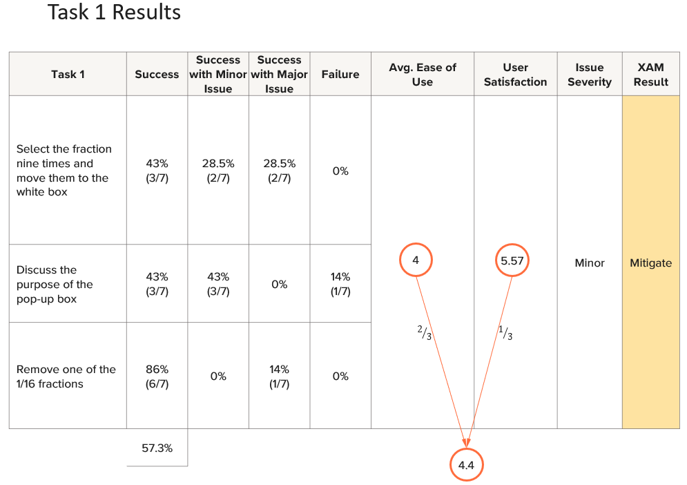
Sample Tasks and Questions
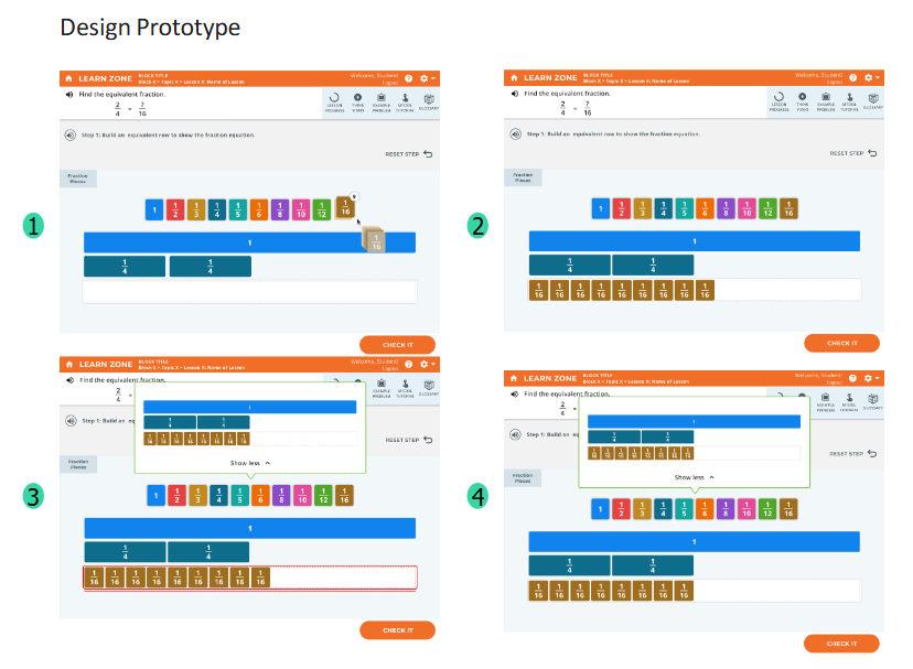
Select the fraction nine times & move them to the white box.
Discuss the purpose of the pop-up box.
Remove one of the 1/16 fractions
Team
Number of Team Members: 6
My Role: Principal Researcher
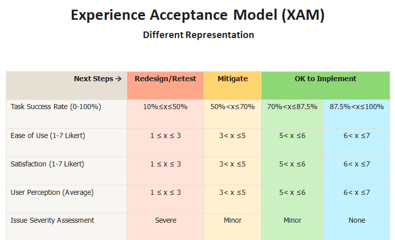
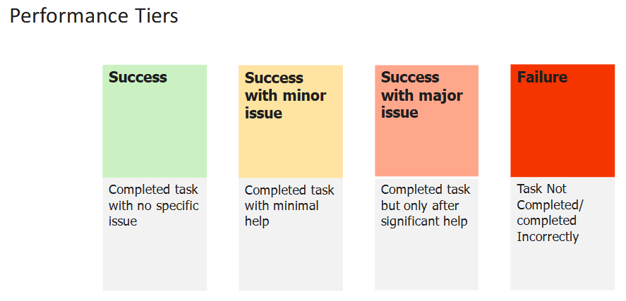
Prototype and Measurement Criteria
Observations
Participants consistently expected to “drag” fractions, rather than click.
Participants had varied interpretations of the pop-up box. Some identified the box purpose correctly, some thought it is the mirror of their answers, and one couldn’t understand the purpose/meaning of it.
Removal interaction was unintuitive; although most participants eventually succeeded, it was through trial-and-error rather than clear understanding.
Key Insights
The current design conflicts with users' mental models, as most naturally expected drag-and-drop interactions. Additionally, limitations in the prototype caused users to struggle when attempting to move the fraction before selecting it nine times—an issue that does not occur in the actual product.
Feedback box design currently lacks clarity and is not self-explanatory, resulting in inconsistent understanding among participants.
Current removal interactions lack clear affordances, leading to guesswork. Users expect an obvious and intuitive removal mechanism, supported via explicit visuals.
Recommendations
While addressing the accessibility requirements, consider including both interaction designs to align with users’ intuitive expectation of drag-and-drop functionality.
Provide an intuitive, familiar removal option, such as a clearly labeled "trash bin," an "X" icon, or explicit instructions (e.g., "click again to remove").
Clearly label the pop-up box to explicitly indicate its purpose (e.g., "Correct Answer"). Also, make the visual indicators such as error signals in red outlines more prominent as it helps users interpret the meaning of the pop-up after seeing it.
Impact
Usability testing reveals confusing screens, unclear labels, and workflow breaks so people can complete tasks smoothly, learn features faster, and feel less frustrated.
Finding usability problems during design or development is far cheaper than fixing them after launch. Early testing prevents costly redesigns, delays, support spikes, and possible recalls.
A consistently pleasant experience builds trust. Satisfied users recommend the product, becoming both repeat customers and organic advocates.
“It showed me what I did wrong and, like, what I need to do.”
Sample Quotes
“there should be, like, a little trash can on the corner, and then you just drag it into the trash can, and then it just disappears”
“[…] but like clicking and like the dragging part was kind of difficult.”